Dashboard
The Dashboard is the entry screen after you log in — a single-glance read on the market, with shortcuts into every other section.
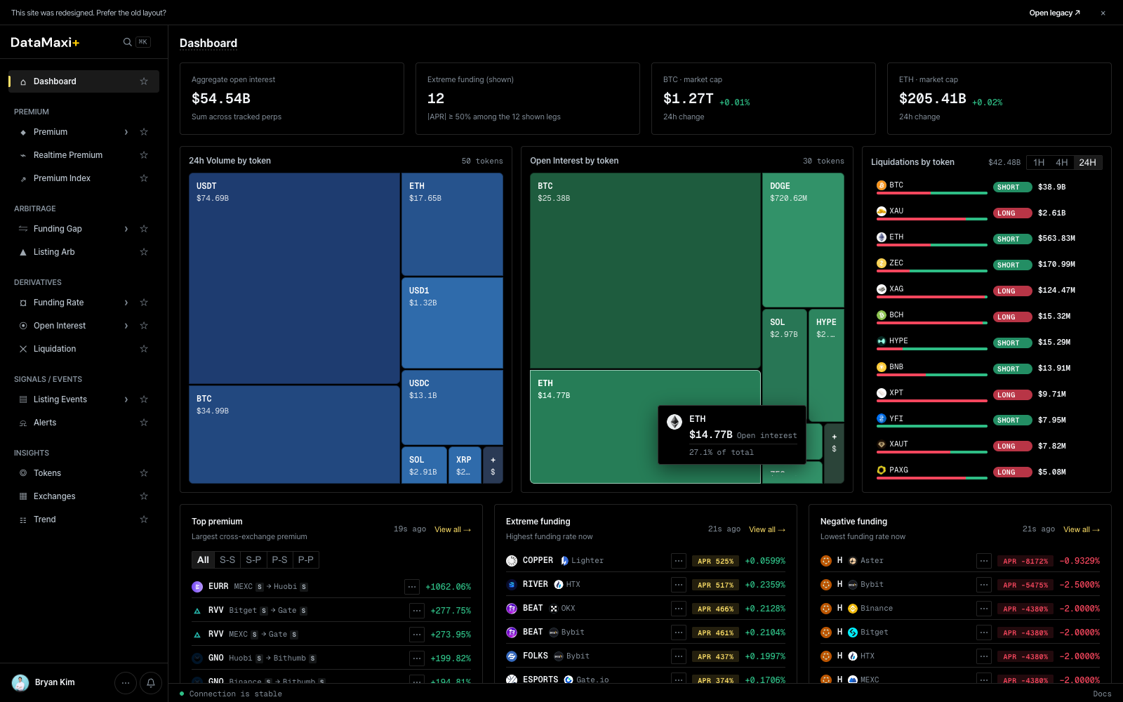
Top stat row
Four headline numbers across the full width:
- Aggregate open interest — total notional OI across every tracked perpetual.
- Extreme funding (count) — number of tokens currently at extreme funding (very long-pays-short or short-pays-long), with the venue spread inside the row.
- BTC market cap — with 24h delta.
- ETH market cap — with 24h delta.
Treemaps
Two large treemaps side by side:
- 24h Volume by token — share of total 24h spot + perp volume per token (USDT, ETH, BTC, SOL, XRP…). Cell size encodes volume share, cell color encodes 24h price change.
- Open Interest by token — share of total perp OI per token. Same color encoding.
Liquidations by token
Right-rail panel with window toggle (1H · 4H · 24H). Each row shows a token, the long vs short split as a horizontal bar (red = long liquidations, green = short), and the dollar size.
Bottom strips
Three side-by-side panels, each with a View all → jump-link:
- Top premium — largest cross-exchange premium right now. Strategy pill row (
All · S-S · S-P · P-S · P-P) lets you filter to the spot-spot / spot-perp / perp-spot / perp-perp leg you trade. - Extreme funding — highest funding rates right now, both extremes.
- Negative funding — lowest (most negative) funding rates.
When to use this page
- Start of session — quick read on where attention should go.
- Spot anomalies (one cell dominating the OI treemap, a token suddenly topping liquidations).
- Jump straight to the deeper view via
View all →on any panel.