Liquidation
The live liquidation feed plus a market-overview header — see liquidations as they hit, and read the regime at a glance.
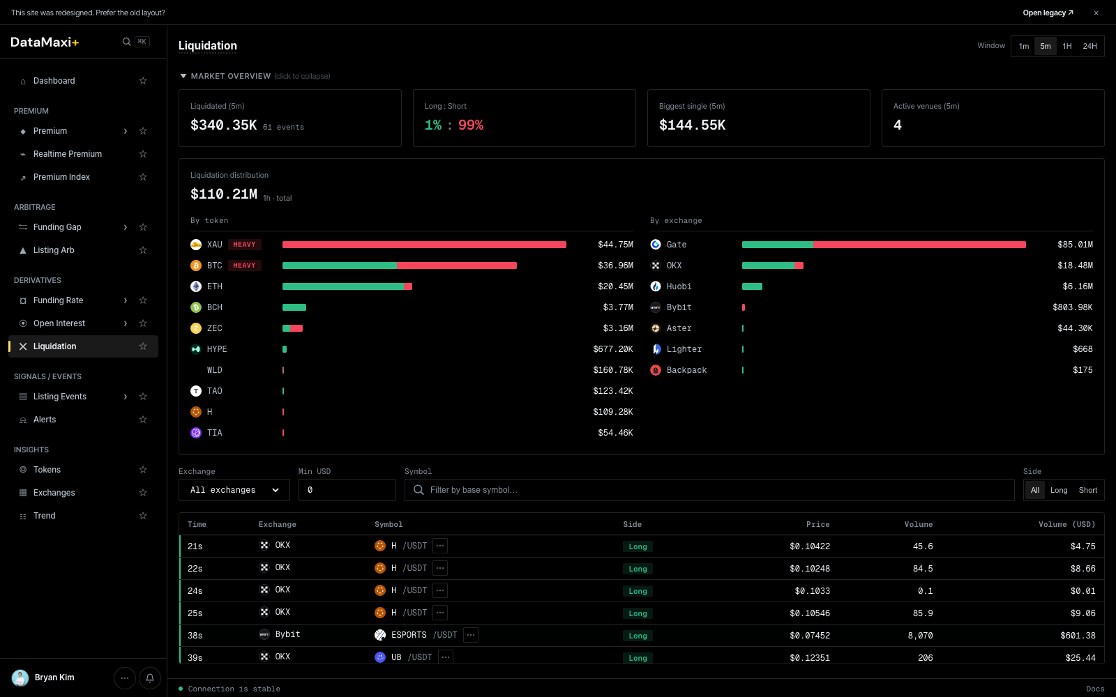
Window selector
Top-right pill: 1m · 5m · 1H · 24H. Sets the rolling window for the overview cards.
Market overview (top, collapsible)
Four headline cards over the chosen window:
- Liquidated — total liquidation notional + event count (e.g.
$1.58B · 156 events). - Long : Short — % split of long-side vs short-side liquidations (
80% : 20%reads as "longs got smoked"). - Biggest single — largest single liquidation in the window.
- Active venues — number of venues that produced at least one liquidation event.
Below the cards, a Liquidation distribution chart breaks the same total down two ways side-by-side:
- By token — horizontal bar per asset, color-coded long vs short, with the dollar size on the right.
- By exchange — same shape, but per venue.
A HEAVY tag marks tokens with abnormally large liquidation flow in the window — the assets to watch.
Filter bar
- All exchanges ▼ — venue filter.
- Min USD — drop micro-events below this size.
- Symbol — search to a base asset.
- Side pills —
All · Long · Short.
Live feed table
| Column | Description |
|---|---|
| Time | seconds ago (6s, 11s, …) |
| Exchange | venue (Bybit, OKX, …) |
| Symbol | base asset + quote (USDT) |
| Side | Long or Short chip (red / green) |
| Price | liquidation price |
| Volume | liquidated size in base asset |
| Volume (USD) | USD-converted size |
New rows append at the top in real time.
Detail view
Clicking any liquidation event navigates to /liquidation/<token> — a per-token liquidation profile.

Header
- Token symbol + glyph +
TOKEN-LIGHTchip. - Window pills (
1m · 5m · 1H · 24H) — applied to the cards below. - Four headline cards for the chosen window:
- Total liquidated (USD).
- Long : Short ratio.
- Biggest single liquidation.
- Active venues count.
Liquidation Map (left chart)
A combined histogram + cumulative-curve chart. Bars show liquidation volume per price-bucket (red = long liquidations, green = short); the overlaid curves show the accumulated long-liquidation USD and short-liquidation USD totals as price moves up. Use it to spot the dangerous-side levels — where a price move will trigger the next cascade.
Liquidation History (right chart)
Time-series of long vs short liquidation events for the token. Pair with the Map chart to see when the cascades clustered.
Recent liquidations table
Live feed of the most recent events for this token, with venue / side / price / volume / total. Same shape as the parent page but filtered to this token.
24h liquidation markers
A condensed price chart with liquidation events marked along the price line — a visual confirmation of "did the liquidations happen at the wick or on the way down".
When to use this page
- Live regime read: a sudden shift in Long : Short tells you which side is unwinding.
- Cascade watch: rising "Biggest single" + falling "Active venues" can signal a venue-specific squeeze.
- Risk: see if a token you hold is in the
HEAVYlist — your funding/borrow may move soon.